
Best Way To Practice Cursive Lettering
PRACTICE MAKES PERFECT!
I‘m sure you‘ve heard this often...
Heck, I say it all the time.
but just HOW DO YOU PRACTICE something to master something?
That‘s a great question!
If you want to find out how to practice cursive lettering, I‘ll show you how!
Today I am showing you an awesome way to practice your cursive lettering!
We‘ll start with what you need in this tutorial,
get ready with setting guidelines,
drawing out a full skeleton alphabet
and finally, add weight.
And look at how you can create an awesome practice routine.
Here‘s what you‘ll need:
Pencil, Pen & a few sheets of Paper. it can be ruled or just blank.
If you struggle with drawing straight lines, also grab a ruler!
Let‘s get started!
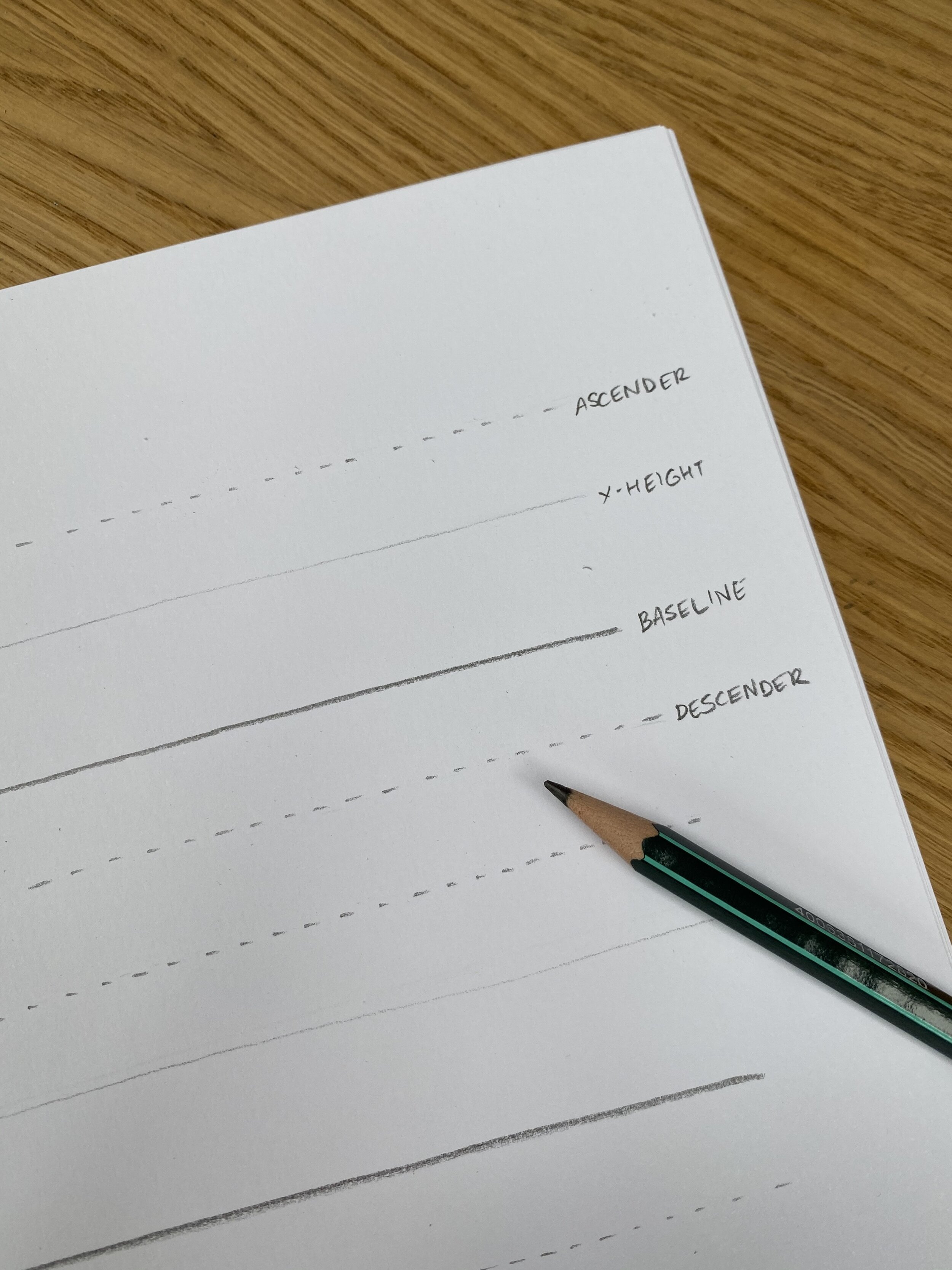
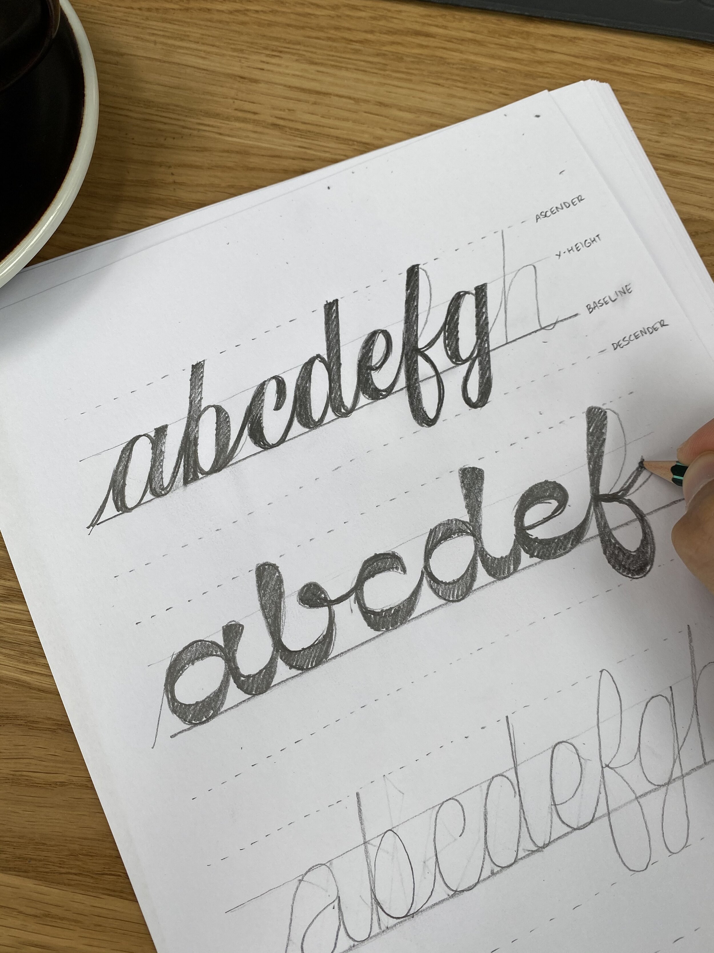
STEP 1 - SETTING GUIDELINES
Let us first prepare our blank page by adding four helplines.
Baseline.
x-height
Ascender
Descender
(The first two are essential. And I recommend adding these whenever you draw a cursive word. It will help make it more consistent and clean.)
Repeat this until you filled the page.
Don‘t worry if the lines are not perfectly straight, parallel or equally spaced.
You can add inclination guidelines as well. But we‘ll move on as is for now.
I‘ve created a sheet for you so you don‘t have too, you can simply print this out:
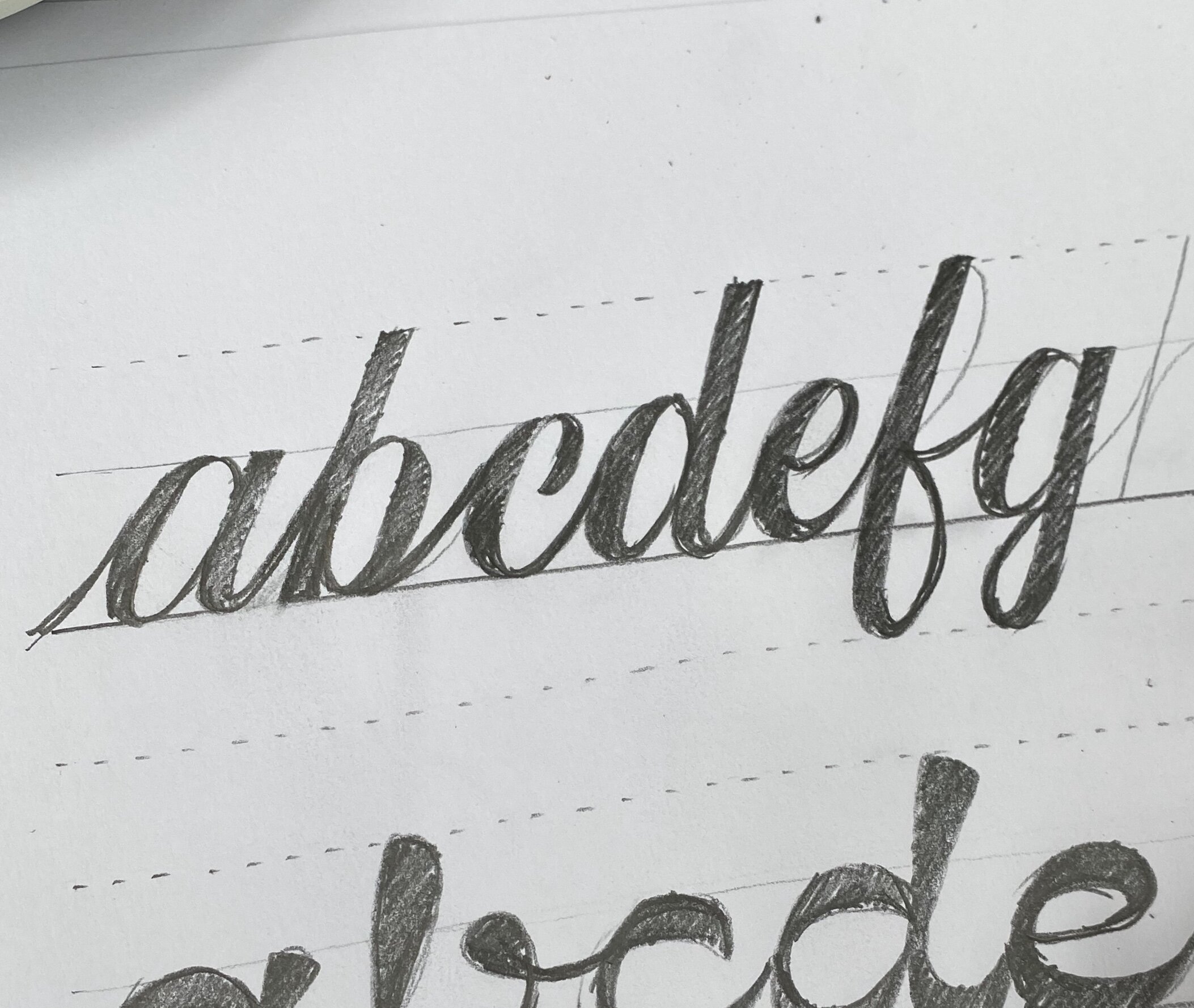
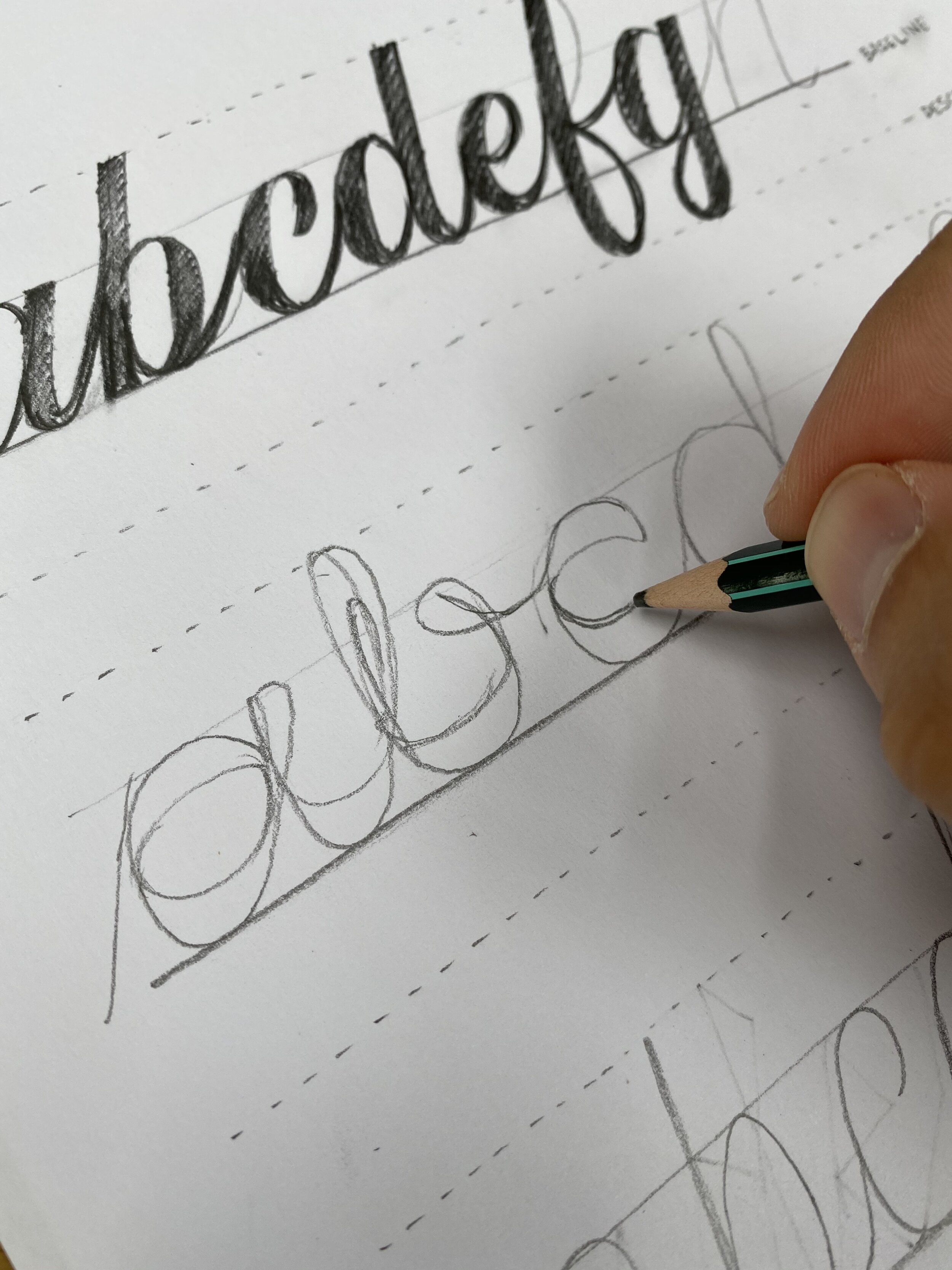
STEP 2 - SKELETON LETTERS
The practice is split into two parts. The letter form and weight.
The first part of the practice focuses on the letterform or shape.
It‘s practically a writing exercise.
We‘ll be writing the entire alphabet just in a single stroke.
Trying to keep every letter consistent. similarly shaped,

Experiment with different shapes and forms.
Try to create 5-6 entirely different styles of cursive alphabets.
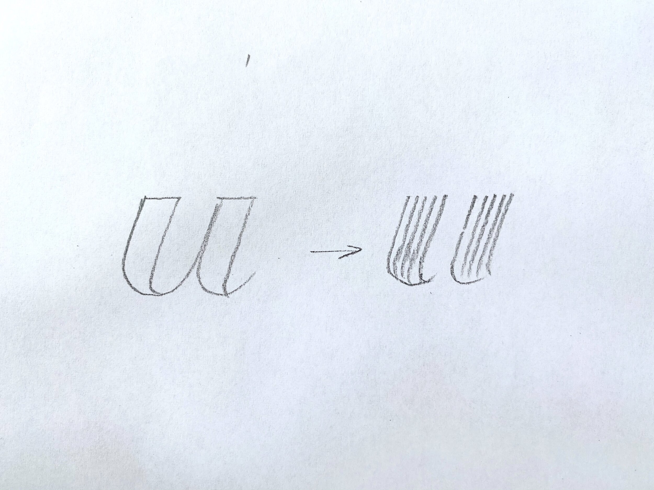
STEP 3 - ADDING WEIGHT
Now that we have the skeleton, let’s add some weight and give it a distinctive style.
We‘ll be going through 3 styles together.
Traditional contrast
Monoweight
Inversed contrast
STYLE N1 - TRADITIONAL CONTRAST
I feel this is one of the most important rules in lettering, calligraphy and type design, unfortunately, one that I learned of really late:
upstroke thin, downstrokes thick.
SIDENOTE: For this reason, how you draw your letters is important and worth going over and see if it is correct. But I found that generally, it‘s 80% correct.
With the pencil, start drawing and inline/outline where it fits best to increase the weight.

An easy trick to make everything more consistent ist to add multiple lines closer together.
Example: Instead of just doing the outlines, I‘ve drawn 5 lines, which are closer together in order to make it easier to nail the thickness every time.
Apply this style to all the other letters of your alphabet. That way you‘ll practice how to apply a style, weight to every letter.
Let‘s move on to the next style:
STYLE N2 - MONO WEIGHT
As the word describes it, mono means one, single weight. It‘s basically the opposite of contrast. But you can define the thickness yourself.
It can therefore be thin as is, or extremely thick as well as everything in between.
Some Monoweight styles also just look like they all have the same weight but the expert level is when you are able to make minor optical adjustments that it appears all the same.
We start in the same way as before:
adding weight by drawing outlines here and there to achieve the monoweight effect.
Don‘t be afraid of not getting it perfect. This is a practice exercise. Play with it.

STYLE N3 - INVERSED CONTRAST
One of my favourite styles and I guess I can say that this has become one of my signature styles, the inversed contrast cursive type style.
And this is how you can achieve it:
instead of adding the weight on the downstrokes, we are adding it at the top and bottom. And here‘s the trick. You basically mix two letters together. A narrow tall letter and a smaller wider letter:

Let’s apply this on each letter by drawing a smaller, wider letter inside.
Feel free to be creative where you are uncertain. If it looks wrong, just try drawing it differently until it looks right. Let your intuition guide.
Finally, fill it out.
Congrats. You just created three distinctively different cursive lettering styles.
PRACTICE ROUTINE
Now it‘s time to create a practice routine.
Here‘s how I would suggest you do it:
Start Monday: Draw out 5 different alphabet skeletons.
Tuesday: Add weight to one of these skeletons.
Repeat this exercise every day until Saturday.
Start again next week.
Thank you soo much for reading!
Why not share this blog post, if you learned something new, with someone to help them get better.
Happy practicing,
Stefan